vans magazine ad
description
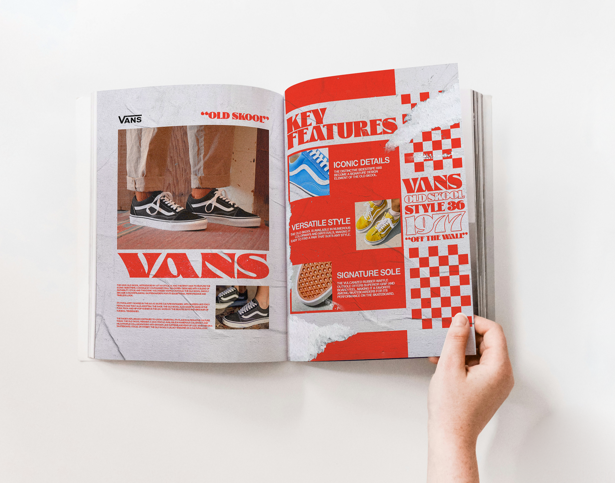
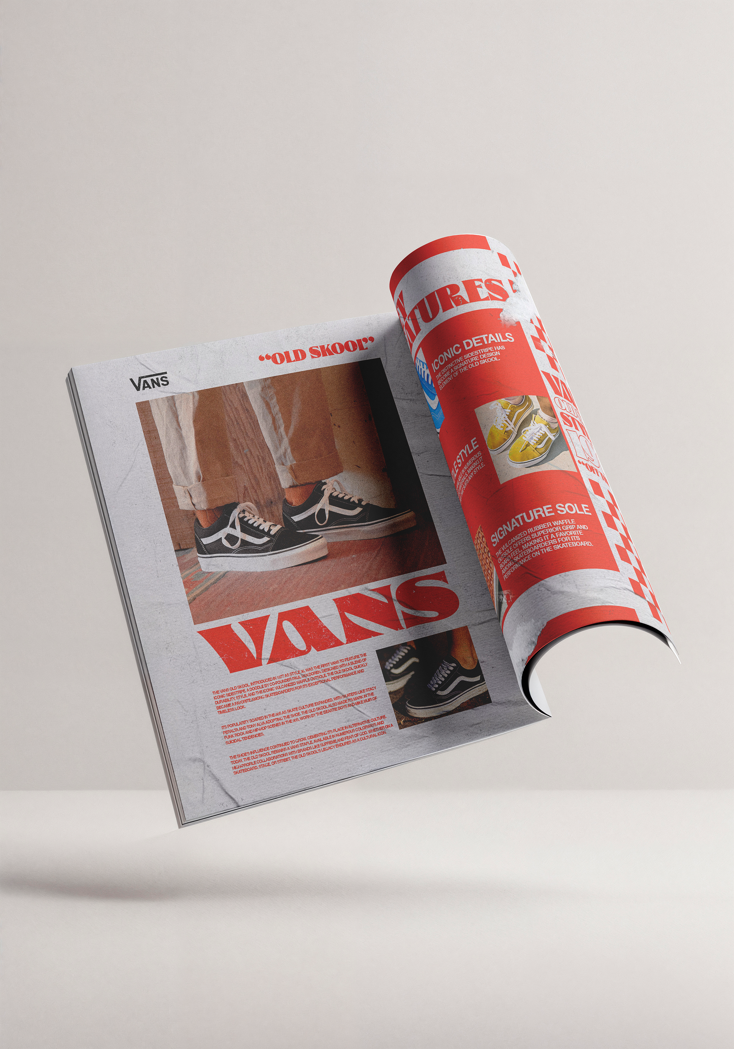
For fun, I challenged myself to create an advertisement using texture as a key design component.
Since Vans are a popular skateboarding and streetwear shoe, I used a distressed paper texture to emphasize the brand’s ruggedness and durability.
The Glodok Display typeface complements Vans’s retro and artistic aesthetic, as does the checkered pattern, a signature design element found on many shoes and apparel. The bold red helps symbolize the brand’s expressive identity.